7 Best Practices For Email Design To Elevate Your Email Marketing
30 Second Summary 1. Email design plays a crucial role in the success of DTC e-commerce businesses by capturing attention and compelling action. 2. Visual hierarchy guides readers’ attention, and scannability enhances engagement. 3. Customizing the copy-to-image ratio based on...
Related Partners

1. Email design plays a crucial role in the success of DTC e-commerce businesses by capturing attention and compelling action.
2. Visual hierarchy guides readers’ attention, and scannability enhances engagement.
3. Customizing the copy-to-image ratio based on industry, brand, and email type optimizes the impact.
4. Strategic CTA placement and clear, compelling button copy increase click-through rates.
5. Personalization goes beyond addressing recipients by name and focuses on relevance and meeting individual needs.
6. Brand consistency fosters recognition and recall, creating a cohesive brand experience.
If you believe that email design is merely about making your emails visually appealing, then you’ve missed the mark. Email design is the final step in email strategy to drive revenue & convert customers.
In this blog post, we will explore the 7 email design best practices to beyond aesthetics & make your emails effective:
- Visual hierarchy
- Information architecture
- Copy-to-image ratio
- Scannability
- Call-to-action (CTA) placement
- Personalization
- Brand consistency
Get ready to redefine your approach to email design & master these concepts to create high-converting emails.
Anatomy Of An Email: Using An Email Layout
Email design all starts with the email layout. An email layout is the bones of your email design. Without a strong, high-converting email layout, an email can look beautiful but it won’t convert. Think of it kind of like the wireframe of your website. It helps you plan the structure of your email & the contents of each section.
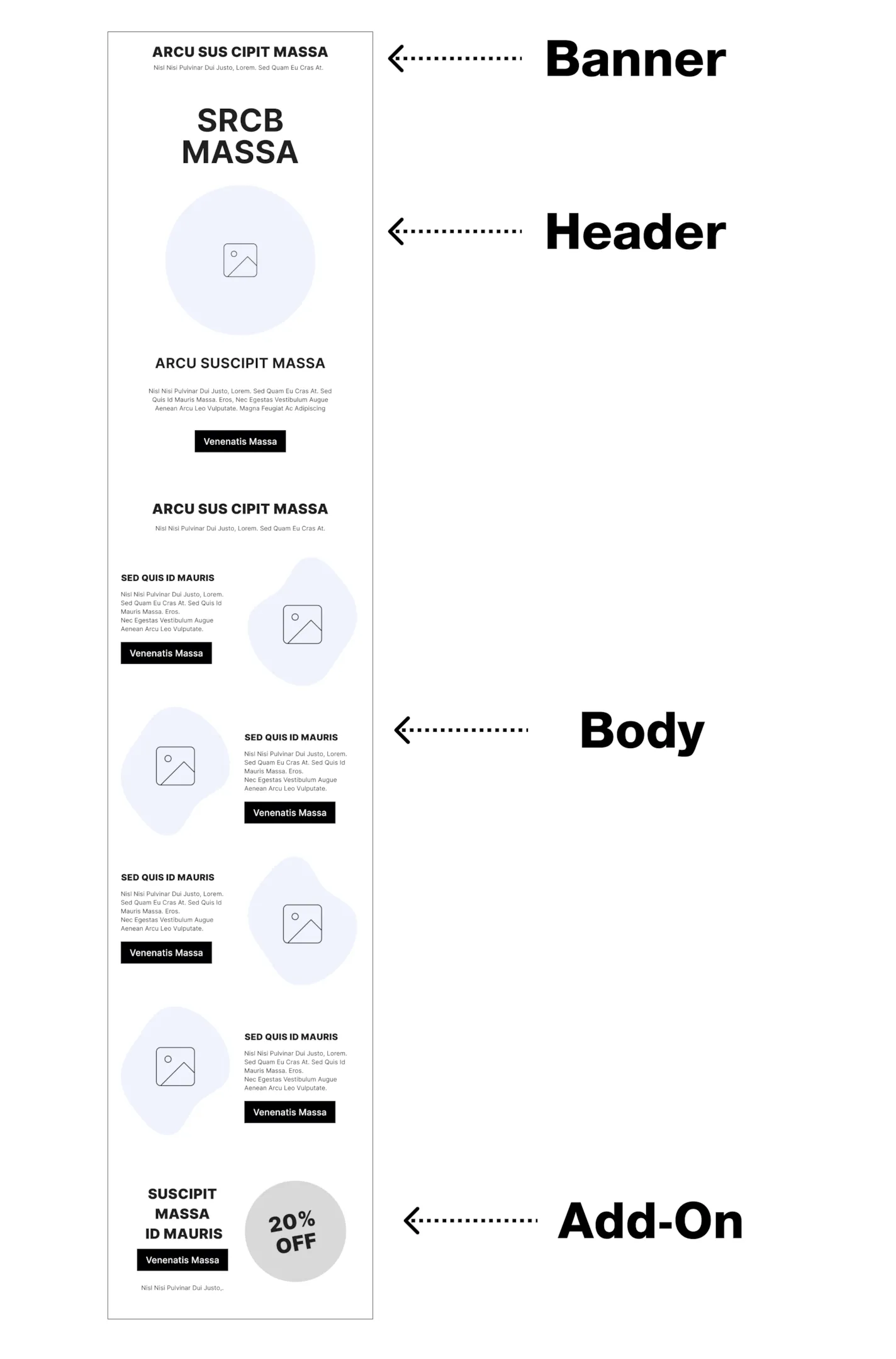
Use Backbone’s Email Layout Builder to generate high-converting, custom email layouts for your brand in seconds.
7 Email Design Best Practices
1. Visual Hierarchy: Guiding Readers with Email Layout and Design
The visual hierarchy is how you structure an email to tell readers what is most important & helps them quickly understand what they are looking at.
Establishing a clear visual hierarchy involves strategic organization, placement & sizing of elements such as headlines, images, body copy and call-to-action buttons. This is where the true value of an email layout comes into play. Much like a website wireframe, it enables marketers and designers to establish a well-defined visual hierarchy for each section which makes the purpose of each section crystal clear.

For instance, when presenting a product recommendation section, the structural design should inherently resemble a product recommendation, even without any copy or elaborate design elements. This consistency in structure allows readers to immediately grasp the essence and relevance of the content such as, “Oh, I’m being recommended products I might like!” to keep their attention & drive them to action.
2. Information Architecture: Structuring the Flow of Information in Your Email
Information architecture involves structuring the flow of information within an email so that each part of the email builds upon the previous one to drive the reader to action. Each email is like a mini sales funnel
Subject Line —> Email Header —> Section Headlines —> Section Content —> CTA Button
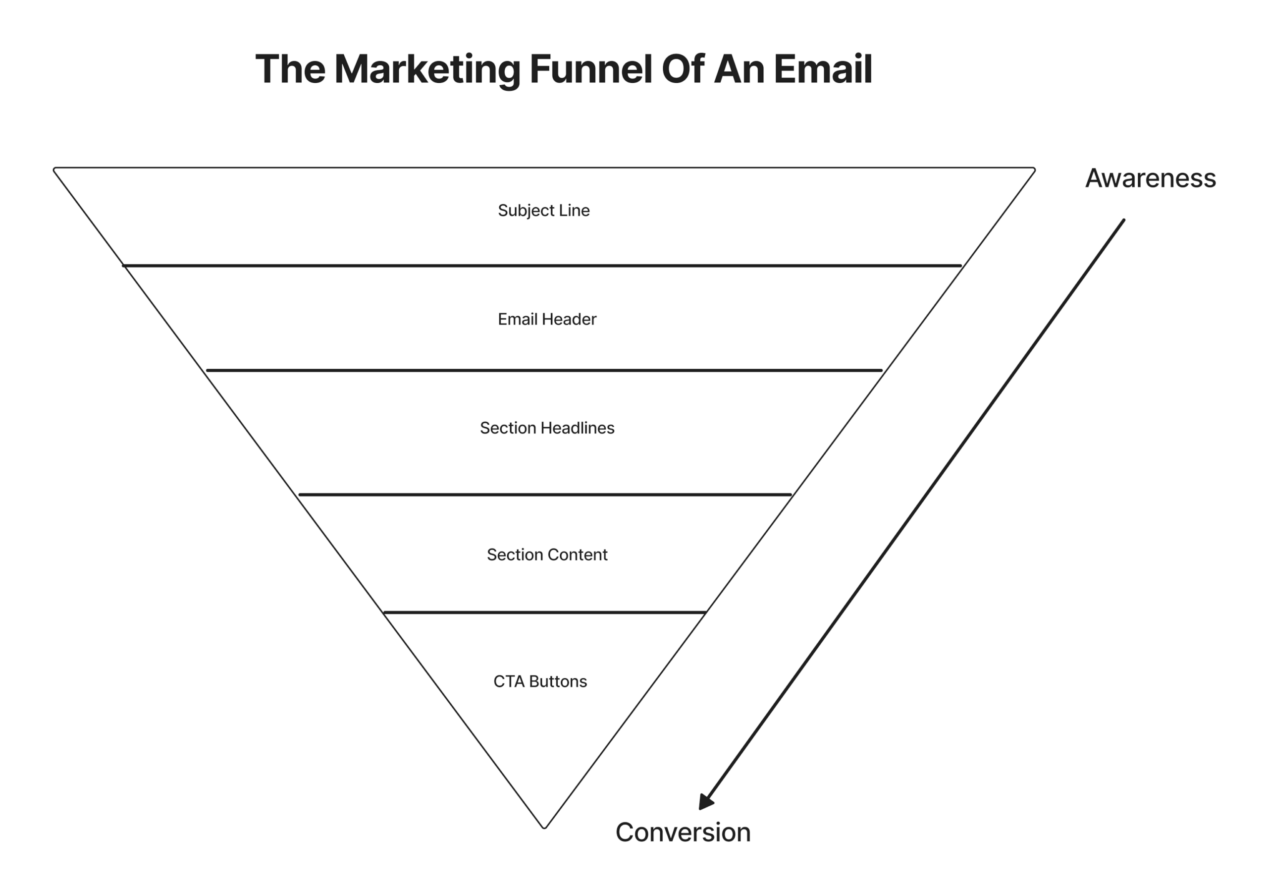
The role of the subject line is to drive the audience to open the email to read the header…the header needs to hook them in to want to skim the section headlines… the headlines of each section need to be clear & interesting enough to hook them to read the content of each section… and the content of each section need to be interesting enough to get them to click through to shop on site.
3. Copy-to-Image Ratio
The copy-to-image ratio is the balance between the amount of text and visual elements in an email. Finding the optimal copy-to-image ratio varies based on industry, brand, and the specific type of email.
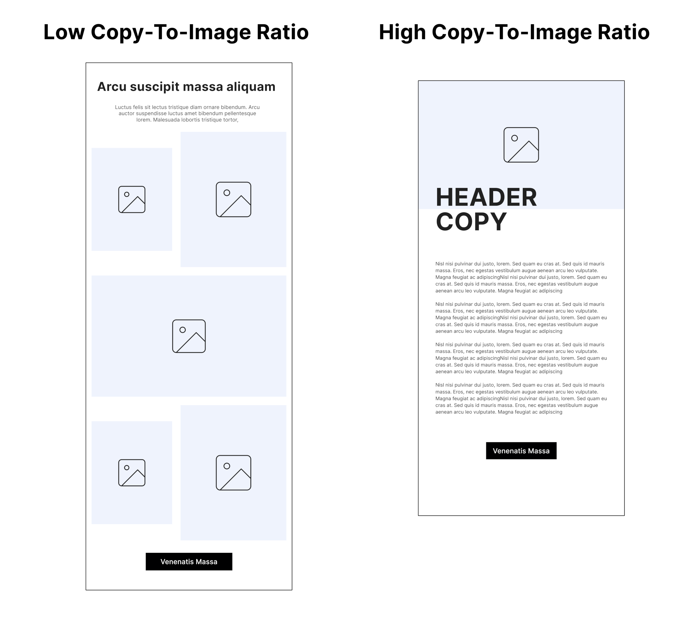
For example, a health & wellness brand that their customers look to for nutritional education may find that emails perform better with long-form copy, while a fashion brand like Reformation has higher-performing emails when they primarily use images showcasing their products.

The email layout itself provides a visual representation of the copy-to-image ratio, helping marketers and designers evaluate the balance between text and visuals. By considering the overall look and feel of the email, one can ensure that the copy and images work together to communicate a message more powerfully than they can on their own.
4. Scannability
Scannability refers to presenting information in an email in a way that ensures it can be easily skimmed and understood within seconds. It’s important to remember the short attention span of recipients. Approach email design with the mindset that you only have 1-3 seconds to grab their attention before they close the email.
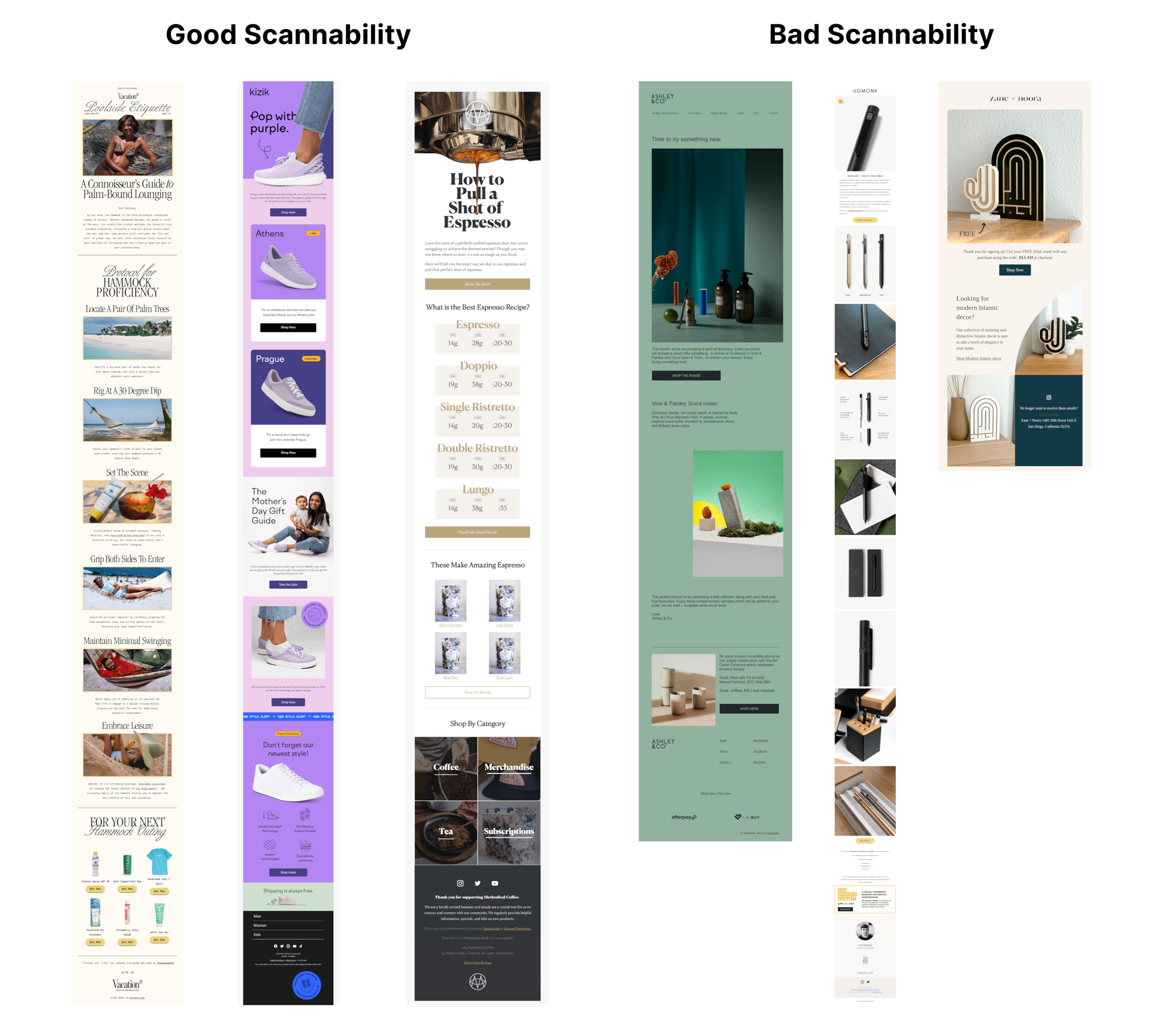
You can make an email design easier to scan by using visual elements such as headings, subheadings, bullet points, and bold text to enable recipients to quickly grasp the key points of the email.
5. CTA Placement: Guiding Readers to Take Action
When it comes to email design, strategic placement of your call-to-action (CTA) buttons is key to driving engagement and conversions. As a basic email design best practice, make sure there prominent CTA is placed in the header, visible above the fold, where it catches the reader’s attention right away. This prime position encourages immediate action and sets the tone for the rest of the email.
Additionally, consider incorporating CTAs in each section of the email. By strategically placing CTAs throughout the content, you give readers multiple opportunities to take action & can drive them to the pages on your website they’re most interested in. However, remember that more is not always better. Too many CTAs can become distracting & confusing.
Two other useful email design best practices include creating hierarchies of CTAs & designing them to be clear buttons. Using visual design to distinguish between major and minor CTAs based on their importance, as well as making them clickable helps guide their focus and prioritize the actions you want them to take.
6. Personalization
Personalization in email design goes beyond addressing recipients by their names. At its core, personalization is an email design strategy to customize the content of each email to make it as relevant to the individual recipient as possible to get them to click & purchase.
It goes beyond surface-level details and delves into what someone truly needs to see in an email to drive them to action…which means you have to deeply understand your customers. This can include personalized product recommendations based on their browsing or purchase history, curated blog content that aligns with their preferences, or reminders of offers unique to them.
For example, you could customize the header design of your email to feature a different product for different recipients, or adjust the copy in your email based on a recipient’s pain points.
7. Brand Consistency: Fostering Recognition and Recall
Last but not least, brand consistency ensures that your email design is aligned with the brand identity your customers experience across each of your platforms, from ads to your website. It involves maintaining consistent visual elements, typography, color schemes, and tone of voice to make your brand recognizable.
By creating a unified brand experience, both aesthetically and in terms of messaging and values, brand consistency strengthens engagement, loyalty, and the impact of email campaigns.
Remember, you may be looking at your brand every day but most of your customers are only seeing your brand briefly as they scroll through their social media or visit your website. You want them to be able to instantly associate each of your emails with your brand to help them recall the products you sell, differentiate you against competitors & how you can make their lives better.
A white-glove service built for success.
We've planned every part of your client experience so you know you're in good hands.
Related Posts

How To Best Use and Understand Klaviyo Flow Filters
As a DTC e-commerce brand, email marketing is one of the most powerful channels to nurture, convert, and retain your customers. But as you grow, customer segmentation becomes an increasingly more important strategy to drive more revenue, higher engagement and more conversions.Enter Klaviyo flow filters.Flow filters might seem like a small, technical feature in learning how to execute email marketing with Klaviyo but they're one of the keys to segmenting your automated flows (along with trigger filters, trigger splits, and conditional splits). Trigger and flow filters act as gatekeepers of your email flows, to allow only the right people to receive the right messages, at the right time.In this guide, you'll learn how Klaviyo flow filters work, ways to use them, and how to set them up for your email flows.What are flow filters in Klaviyo?Flow filters are criteria or conditions you set to determine which email subscribers enter the flow. You can set flow filters based on a variety of conditions such as a customer's location, their purchasing behavior, their engagement with previous emails, or specific characteristics such as their pain points.This allows you to build more customized customer journeys for your email subscribers by having different customers receive different flows.How...

Crafting Engaging Welcome Series Emails: Examples and Templates
30 Second Summary1. 50-75% of the revenue from your Welcome Series typically comes from the first welcome email. So if you do nothing else, focus on doing that right.2. Use the subject line "Welcome to [BRAND]" or "Here's your 10% off code for [BRAND]" to start. Then A/B test.Your Welcome Series is one of the most important automated email flows you can build to set your new e-commerce brand up for success at launch. In fact, if you don't do anything else in email marketing (which we don't recommend!), build your welcome series.Now, you've likely heard that the goal of welcome emails is to introduce or indoctrinate your brand to new email subscribers.But that's not (quite) true.The real goal of a welcome series is to drive your leads to make their first purchase.Done right, a well-crafted Welcome Email Series can accelerate your customers' journey to their first purchase, drastically reducing your cost per acquisition (CPA), bolstering your average dollars per lead and per website visitor, and increasing your average order value (AOV). See why it's one of the most important automated flows you could build?Now, in your research, you've also probably seen lots of inspiration for different welcome emails, been told that "every...

From Zero to Hero: A Complete Guide to Building Your Email List
30 Second Summary1. Your email list is one of the most valuable assets an e-commerce brand can have & building your email list is the first step to effective email marketing.2. Don't make the mistake of building an email list just for the sake of it. You don't just want a list of emails, you want a list of potential customers.3. At a minimum, make sure you have a welcome opt in form, exit intent opt in form, footer signup form, and a sign up form at checkout to capture email subscribers4. Advanced strategies to collect email addresses like lead magnets, quizzes, paid ads, as well as partnerships and giveaways, are other ways to grow your email list5. Regularly clean out your email list, especially for lower-quality leads, and track key metrics such as list growth percentage, unsubscribe percentage, and engagement percentage to measure your success and optimize your email marketingIf you're just getting ready to launch your e-commerce store, or you're new to email marketing, building your email list is an important first step. Your email list is one of the most valuable assets your brand can have to nurture, convert & retain customers to grow your brand.Most e-commerce brands...

How To Use Klaviyo Campaigns
If you're just getting started with email marketing or new to Klaviyo, it's important to get out of the mindset of just sending out email campaigns during promotions or product launches. As an e-commerce brand, you should aim to generate 15-20% of your business revenue from email campaigns.A great email campaign strategy involves creating an effective email marketing calendar, sending campaigns regularly (1-3x per week), and sharing unique email content to build a relationship with customers.Why Klaviyo Campaigns?Campaigns are one-time, targeted emails that are sent to your email list. Mastering Klaviyo campaigns is the first step to learning how to use Klaviyo for email marketing.Klaviyo's drag and drop editor & pre-built email templates make it friendly for beginners. But its extensive A/B testing functionality, segmentation & dynamic content make it incredibly scalable as your business grows.Setting Up Your Klaviyo CampaignThere are a few key elements you'll need to decide on when setting up your Klaviyo campaigns:Campaign name: Choose a descriptive name for your campaign that reflects the topic of the email, the type of content it contains, and makes it easy for you to identify in your dashboards.Recipients: Determine the target audience for your campaign. In Klaviyo, you can choose to select specific segments or lists. Segments...

Don’t Let Them Get Away: Crafting the Perfect Abandoned Cart Email
With cart abandonment rates averaging around 69% for e-commerce stores, you can't afford to let potential sales slip through the cracks. Abandoned cart emails target these customers who abandon their cart to get them to return to make a purchase. Building an effective abandoned cart email can be quick & easy with the right strategy.By the End of This Blog, You'll:1. Confidently build your first abandoned cart email to convert more customers & drive more revenue2. Understand the core elements that make up an effective abandoned cart email3. Have conversion-optimized abandoned cart email templates to use4. See examples of great abandoned cart emails & subject lines for inspiration5. Have a list of A/B tests to optimize your abandoned cart email strategyOther Resources You May Find Helpful:Our DTC Flow Foundations Guide: This is your ultimate playbook for not just mastering the art of abandoned cart emails, but creating a holistic suite of email flows vital for any DTC e-commerce brand. From welcome series to customer re-engagement strategies, it's all there.Our Free Beginner's Guide To Email Marketing: Starting from scratch? No worries. Our beginner's guide provides you with the A to Z of email marketing. It is tailor-made for e-commerce brands and...

21 Email Marketing Examples to Inspire Your Next Campaign
In the competitive world of DTC e-commerce, a crucial element of customer retention is keeping customers engaged with your brand. Email marketing campaigns are a great way to stay top of mind and relevant to your customers. It's not enough just to send email marketing campaigns about your product. To drive engagement, loyalty, and sales, you need impactful, unique & relevant email campaign topics. That's where an effective email marketing campaign strategy starts.We've put together 21 email marketing examples that are more than just creative inspirations—they're powerful strategies that have driven results for DTC brands. Use these email marketing examples to inspire your next campaign.Use these email campaign examples to generate 3 new campaign ideas to test in the next 60 days!Effective Email Marketing Examples1. Save The Date EmailsSave The Date emails are perfect for creating anticipation for an upcoming promotion or new product launch. The suspense & advanced notice generates more interest, engagement & revenue on launch day. Add in a calendar invite or link to a Facebook event to easily remind interested customers on the day of launch.We tend to see Save The Date emails consistently work for most e-commerce brands, but are particularly explosive for limited edition...

Email Marketing Metrics: Unlocking the Power of Data to Drive Your Campaigns
Whether you're struggling with the intricacies of Klaviyo's built-in reporting, drowning in an ocean of dashboards, or simply seeking ways to turn your data into actionable strategies, you're in the right place. We're here to help you navigate the complexities of email marketing metrics and tap into the wealth of insights they offer.This blog post is for you if:1. You're still using Klaviyo's built-in reporting & don't know how to interpret the data.2. You have a myriad of dashboards filled with email data, but you're not sure what needs your attention.3. You're feeling overwhelmed with your email marketing data and want to focus on what's important.4. You want to turn your data into actionable strategies to enhance performance.Many DTC ecommerce brands, perhaps even yours, fall into the trap of over-investing in data accumulation and under-investing in actioning on it. This blog post is designed to help you break free from this pattern.What you'll learn in this blog post:1. The key email marketing metrics you should be measuring.2. What your email marketing metrics are telling you about your customers & the effectiveness of your strategy.3. How to interpret your email marketing data through benchmarking red/green/yellow.4. How to devise a plan of...

Email Marketing Analytics and Benchmarking: The Key to Unlocking Your Campaign’s Potential
So you've started running email marketing campaigns, but now what? Most DTC brands just collect the data & measure the performance of their email campaigns. But that's not enough.Which email marketing metrics should you look at? How do you analyze your email metrics? What do you do with that data? And how will you actually adjust your strategy to consistently improve your performance over time?It's not what data you have, but how you use the data that will scale your email marketing performance.Meet the principle of Actionable Reporting.Actionable reporting is all about transforming raw data on your email metrics into meaningful, easy-to-understand insights and applying them to actionable next steps in improving your email marketing performance. It's about identifying trends, finding patterns, and flagging opportunities to not only understand what's working but also uncover areas that need improvement.Mastering the art of Actionable Reporting is learning how to turn data into information, information into insights, and insights into strategy.Data --> Information --> Insights --> StrategyThere are 3 key elements to effective Actionable Reporting:Email Marketing Metrics: Collecting the right data is crucial to the start of this process. Email marketing analytics allows you to dive deep into the performance metrics of your campaigns, identifying what works and what...

The Ultimate Guide to Different Types of Email Marketing Campaigns
Email marketing is an incredibly important channel to master for any DTC e-commerce business. In fact, with the right approach, email marketing can contribute to a whopping 20-30% of your revenue. It's a great way to retain customers, drive conversions, increase repeat purchase rates, elevate customer lifetime value (LTV), get more customers hooked on subscription products and encourage them to splurge on higher average order values (AOV). But it can feel overwhelming with all of the different types of emails, from email campaigns to automated email flows, that you should have.=If you're new to email marketing —we've got your back with this ultimate guide to the different types of emails. By the end of this post, you'll be ready to create a solid email marketing strategy to get your e-commerce store generating $5M, $10M and even $20M+ in revenue.Get a custom-built email marketing strategy with a 14-day free trial of Backbone.Use Backbone to plan out your email marketing calendar with different types of campaigns, flows, promotions & product launches. With over 5000+ unique campaign ideas & 250+ unique flows, everything is customized for your business!Book Your DemoTypes of EmailsNow, let's dive into the most different types of emails that every...
