Chapter 6: Anatomy of An Effective Email
In the rest of our Beginner’s Guide To Email Marketing, you’ve learned how to build an effective email marketing strategy. But no email strategy can be complete without effective, high-converting emails (duh!). But with so many emails flooding inboxes every...
Tags
Tools
Level
Related Partners

In the rest of our Beginner’s Guide To Email Marketing, you’ve learned how to build an effective email marketing strategy. But no email strategy can be complete without effective, high-converting emails (duh!).
But with so many emails flooding inboxes every day, it can be challenging to stand out & get those opens, clicks and conversions. That’s why it’s crucial to understand the anatomy of an effective email and how to design emails that convert.
Whether you’re a seasoned marketer or just getting started, this deep dive will teach you the anatomy of an effective email and provide tips and best practices for designing emails that convert.
The Structure Of A DTC Ecommerce Email
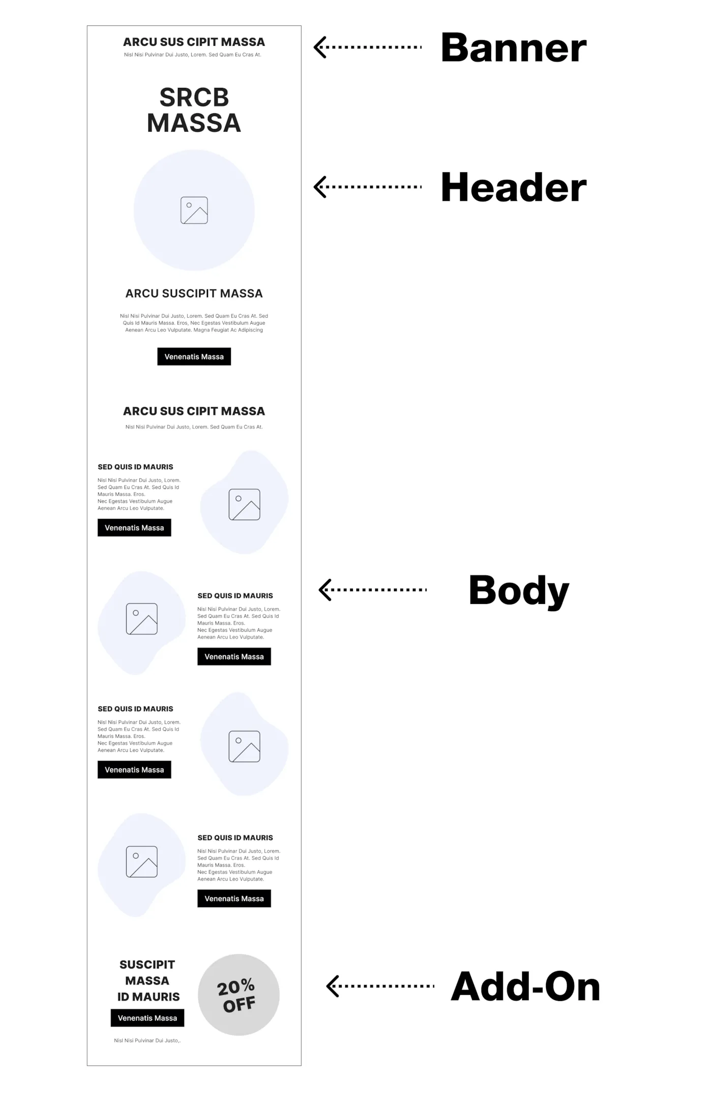
Reaching Your Target Audience
Before you even get to designing the email itself, you’ve got to make sure that your email subscribers will even open your email! That’s where your From Name, Subject Line and Preview Text come in.
These three key elements are the first things your email subscribers see & it determines whether they’ll choose to open your email.
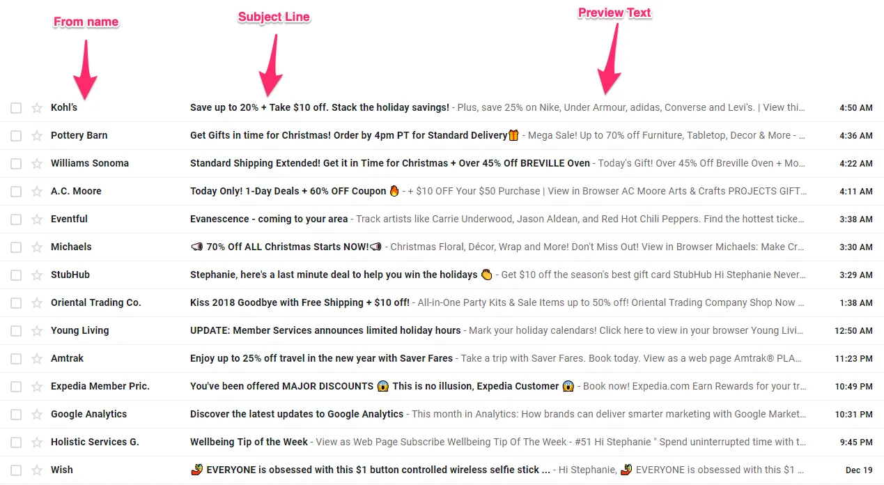
From Name
The from name in an email is the name or company that appears in the “from” field of the email, indicating who the email is from.
This field, along with your email subject line & preview text, is one of the first things that a recipient sees when they receive an email, so it’s important to choose a from name that recipients will recognize in their inbox & is aligned with your brand identity.
Most e-commerce brands stick to their company name as their “From Name”, which is definitely a great way to go for your general marketing emails.
However, it can be worth testing using from names on different types of emails, such as:
• The name of your founder/CEO if they’re recognizable
• The name of a person, such as a customer service representative, rather than just the company name, as this can help to establish a personal connection with the recipient (eg. Amy from Willow)
• If your brand is less recognizable, including the type of product you sell (eg. Willow vs Willow Clothing)
Subject Line
The subject line of your email is one of the most important parts of your email, since it’s what your recipient will first see in their inbox to determine whether they want to open the email.
Let’s start with the basics. When it comes to email subject lines, there are also few hotly debated topics such as the length, and the use of emojis, CAPS, symbols/punctuation & personalization.
Here’s a quick summary of best practices when it comes to writing subject lines that play well with email clients:
Keep subject lines between 61-70 characters. That’s the sweet spot to make sure it gets read & it fits in most recipient’s email client.
Well-used emojis in subject lines can increase open rates – but don’t throw them around randomly! Make sure they’re relevant to the message.
Be careful with overusing CAPS, symbols (eg. $, %), and punctuation since they can trigger spam & promotion filters
Use personalization, such as including their name, to grab attention & increase open rates by over 25%
But writing a subject line for a successful email campaign goes beyond just the tactics above. You also need to make sure you can get your reader’s attention. The best email marketers always remember that effective subject lines need to resonate with your audience.
Think about it this way, you have one sentence & only a second to grab a reader’s attention. Is your subject line compelling enough?
Here are a few different approaches to writing an effective email subject line:
1. Create Curiosity
Get your email readers engaged by invoking curiosity through questions or an interesting statement such as:
• Are you cooking with toxins?
• Find out which outfit is for you
• MYTH: Breakfast is the most important meal
2. Give it a personal touch
Get their attention with personalization or conversation openers such as:
• Do you have dry skin?
• Marissa, we think you’ll like this
• What’s your color?
3. Create urgency or scarcity
When it comes to promotions or product launches, urgency & scarcity can go a long way to compelling interested shoppers to shop:
• Sale ends in T-3 hours
• You don’t want to miss this
• Summer Limited Edition Prints: Almost GONE!
4. Keep it casual
Casual subject lines can work well since it’ll catch readers’ eyes seeming like it’s an email from a personal contact:
• meet later?
• thanks
• think you’ll like this
Preview Text
Preview text, often also called the pre header text, is the snippet of text that appears below the subject line in an email client.
It provides a brief preview of the content of the email and can influence whether the recipient decides to open it. Most ecommerce brands use the pre-header text as a way to share additional information readers might want as a follow-up to the subject line.
Keep this pre header text short, direct & most importantly, RELEVANT, to the email’s subject lines. It should reinforce the subject line and provide additional context or information that may encourage the recipient to open the email.
Here’s a quick summary of best practices when it comes to preview text:
- Keep it to 50-60 characters in length
- Avoid repeating the subject line – you want to add to it.
- Avoid simply using the first few sentences of your email as your preview text.
- Write a custom preview text for each email.
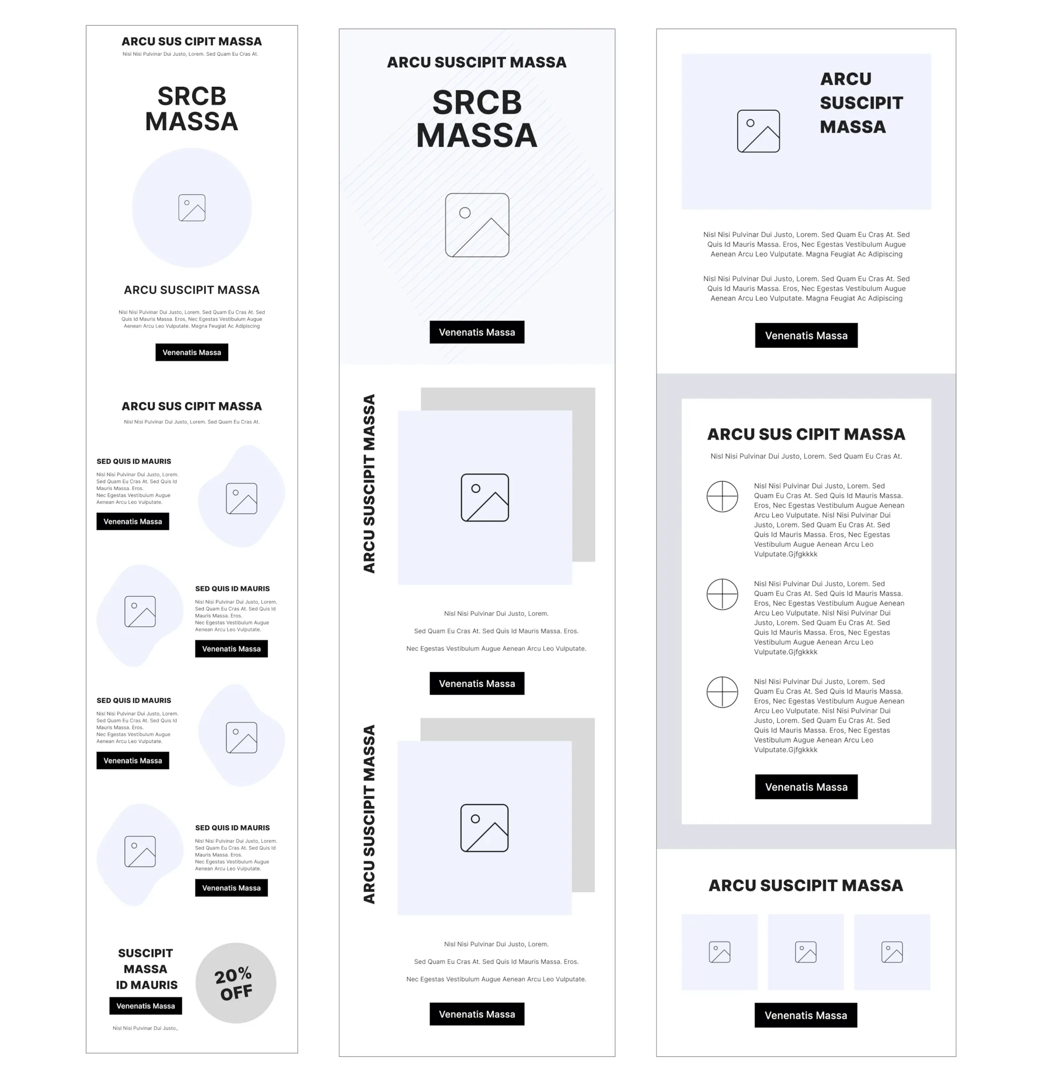
Email Layout
The email layout is essentially the structure of your email content and how each section of your email will layout visually. Think of it like a wireframe for your website.
The email layout helps separate logical divisions of the content of your email & ensures that there is a strategic, well thought out structure before you start copywriting & email design.
The most effective, high-converting email campaigns have a good email layout that makes it easy & engaging for customers to read. It also establishes a clear visual hierarchy of information so customers know what the most important information & actions are.
You can use a tool like Backbone to generate you a optimized, high-converting email layout for each of your email campaigns and flows. Most ESPs such as Klaviyo and Mailchimp also include email templates to give you a starting point in building your email layout.
Banner
A banner in a DTC ecommerce email marketing campaign is a short module above the header, and sometimes above the navigation bar as well. Think of the banners you’ll often see on a web page.
It’s one of the first things a recipient sees when they open the email, so it’s important that it is bold & eye-catching.
Some example use cases for a banner in a DTC ecommerce email campaign include:
• Promoting a sale or special offer
• Reminding customers of a new product that recently launched
• To drive urgency for a sale or product
• To encourage customers to opt-in to SMS
• To drive awareness for special programs, such as a loyalty or referral program
• To drive awareness for special announcements, such as the launch of a retail location or a partnership
An effective banner should have short, tagline-style copy that is bold and to-the-point. You don’t have much space on a banner (often only 1-2 lines of text), so you want to communicate the main message clearly & directly. Some banners also include a call to action button to drive traffic to specific pages that may contain more information or allow recipients to shop.
Navigation Bar
This is a tactic taken from web design that is commonly used by DTC ecommerce brands. A navigation bar in email marketing is similar to those you would see on a ecommerce site web page, with links to a few key landing pages that are commonly visited by shoppers.
Here are a few typical pages to add to your email navigation bar:
• Shop
• Best Sellers
• New Arrivals
• High-converting collection pages (ie. Shop Men’s, Shop Women’s)
• High-converting product pages
• Blog
The goal of a navigation bar is to increase clickthrough rates by providing direct links to the most popular pages. Most email clients have a built-in navigation bar that you can easily drag and drop into your email builder.
Header
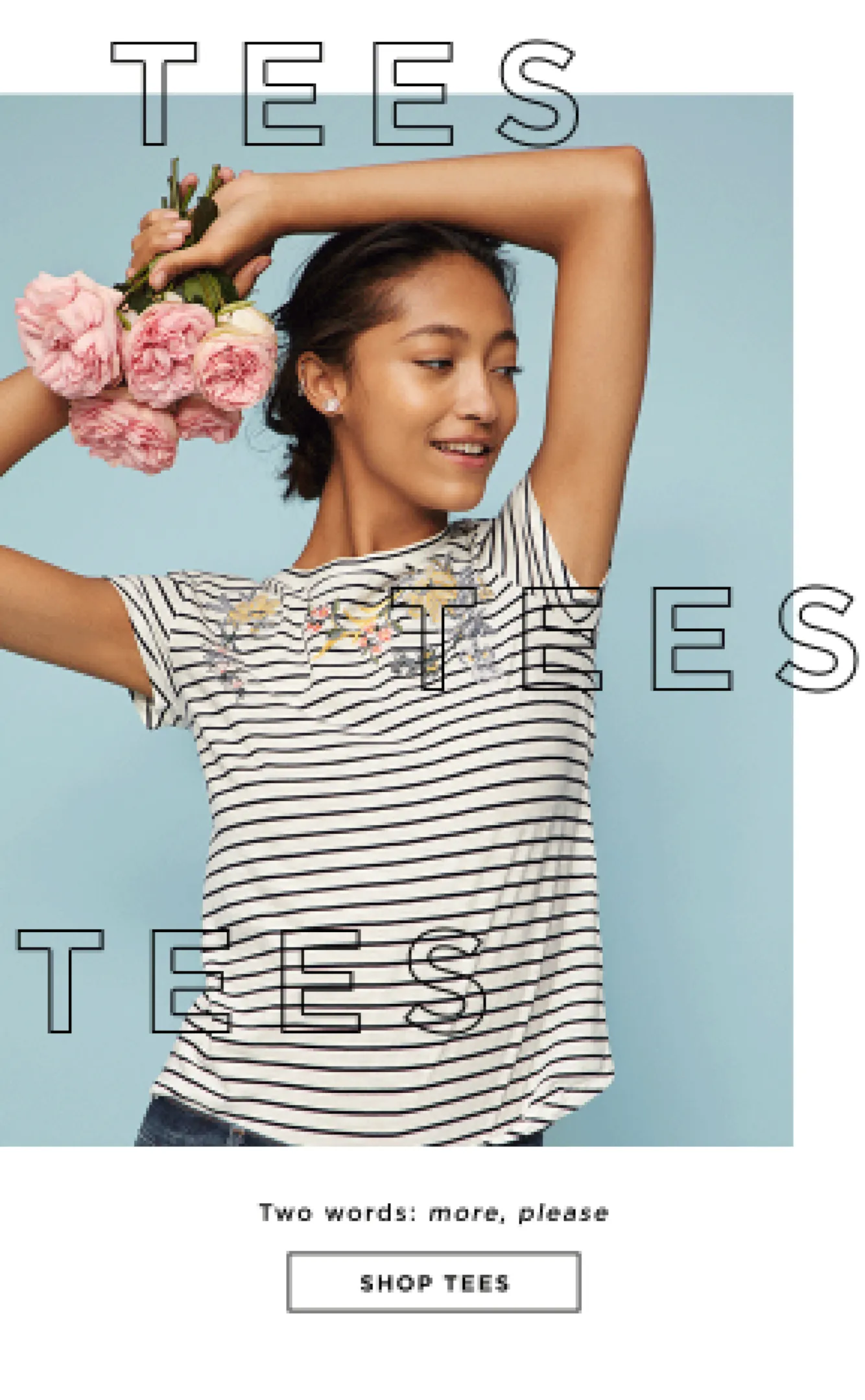
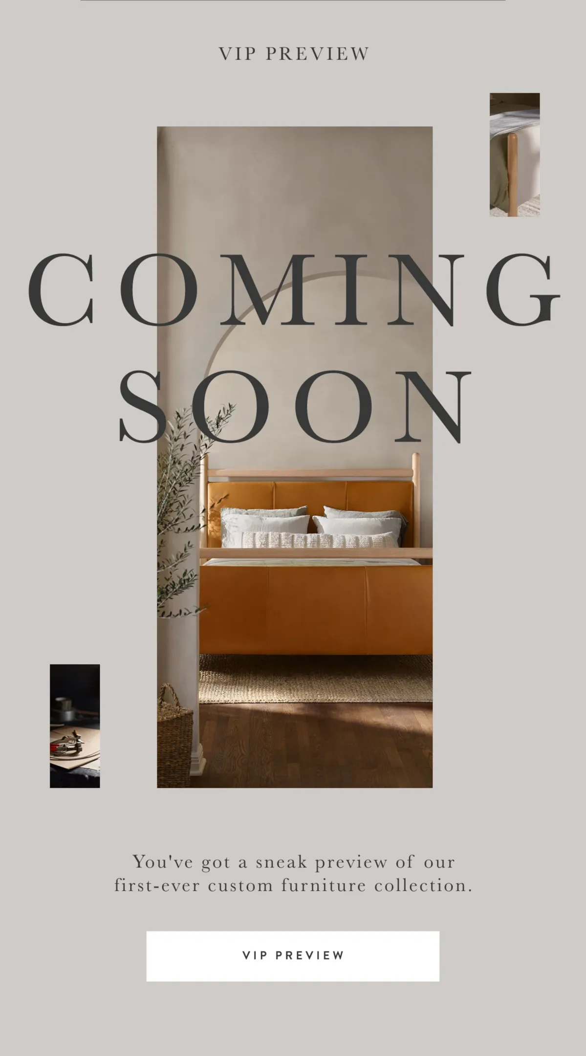
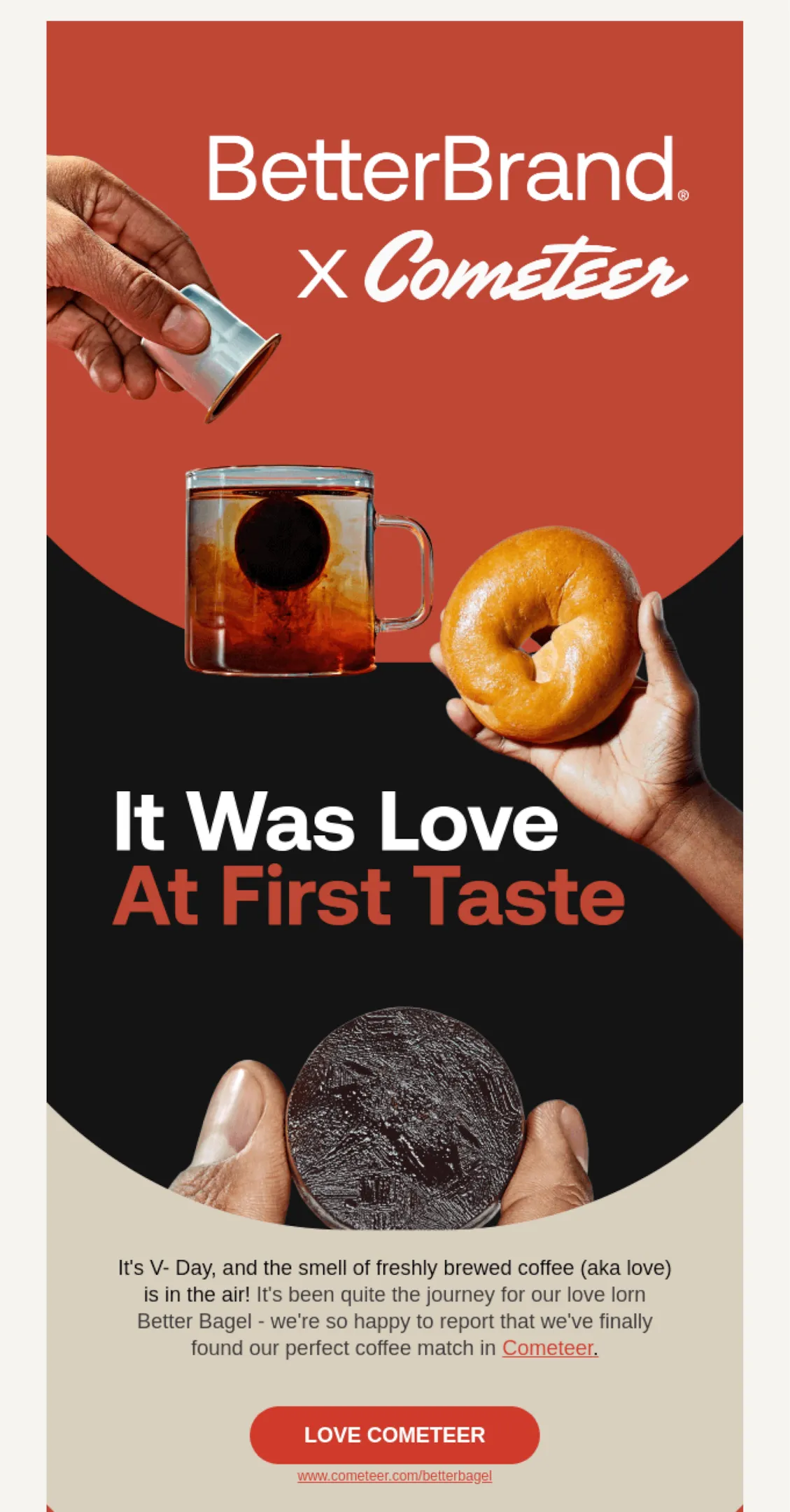
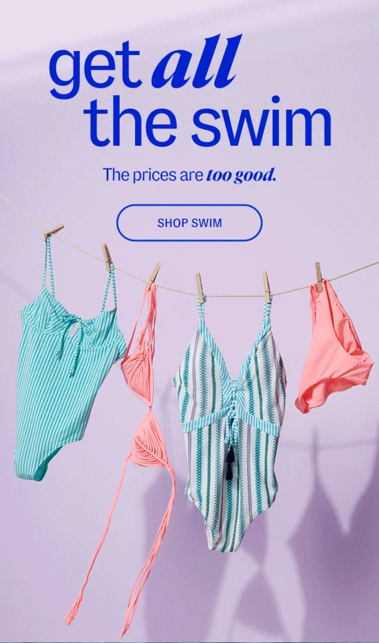
The header of your email is one of the most important components of your email since it is the first thing a recipient sees when they open your email.
The objective of the header is to hook the reader’s attention in to either continue reading or to click through to shop. This means it needs to be eye-catching, clear & compelling.
An effective header always has:
• A bold, engaging headline to get the reader’s attention
• Attractive, eye-catching product photography or design elements to stand out visually
• A clear call to action to direct the reader on what to do next
The No-Scroll Test is a quick test you can use when reviewing your email headers to see if it is effective & compelling to get recipients to read the rest of the email.
Review this email as if you’re on the bus or in line flipping through this email in your inbox quickly without scrolling.If you just look at the header:
Is it clear what the email is about? Do you see a call to action button?
Does it make you want to click or continue reading?
Header Examples :

Body
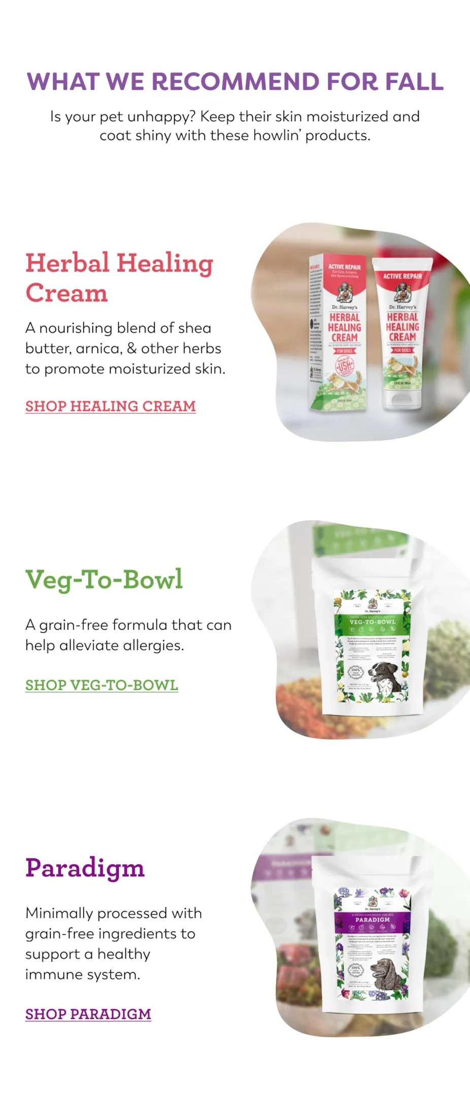
The body of a DTC ecommerce email is the main content section of the email that provides information and promotes products to the recipient. The body of the email should be visually appealing and easy to read, and it should effectively convey the message and call-to-action of the email.
The body of the email should provide additional information that the recipient needs to get them to click through to make a purchase or understand more about your brand.
There are several common types of modules that are frequently used in the body of DTC ecommerce emails, such as product highlight modules, product grid modules, blog roundups, and information blocks.
Product grid modules promote best selling products & display multiple products in a grid format, making it easy for recipients to browse and compare products. Product highlight modules focus on a single product, showcasing its features and benefits in more detail. Blog roundup modules provide links to recent blog posts, providing a way to promote the company’s blog and drive traffic to the website. Information blocks provide important information, such as shipping information or customer service contact information.
The body of an email is where the majority of the email’s content is displayed, so it’s important to carefully consider the design and structure of this section to ensure that it effectively communicates the message and drives conversions. By using a combination of these different types of modules and incorporating best practices for design and layout, you can create emails that effectively promote their products and drive conversions.
Pro Tip:
The 5-Second Scroll is a quick test you can use when reviewing the body of your email to make sure it is cohesive & communicates the main message of your email clearly.
Review this email as if you’re doing a quick single scroll on your phone:
• Is it clear what this email is about?
• Is it clear from each section what you’ll learn from this email?
• Is it clear what the main call-to-action of the email is?
Body Examples
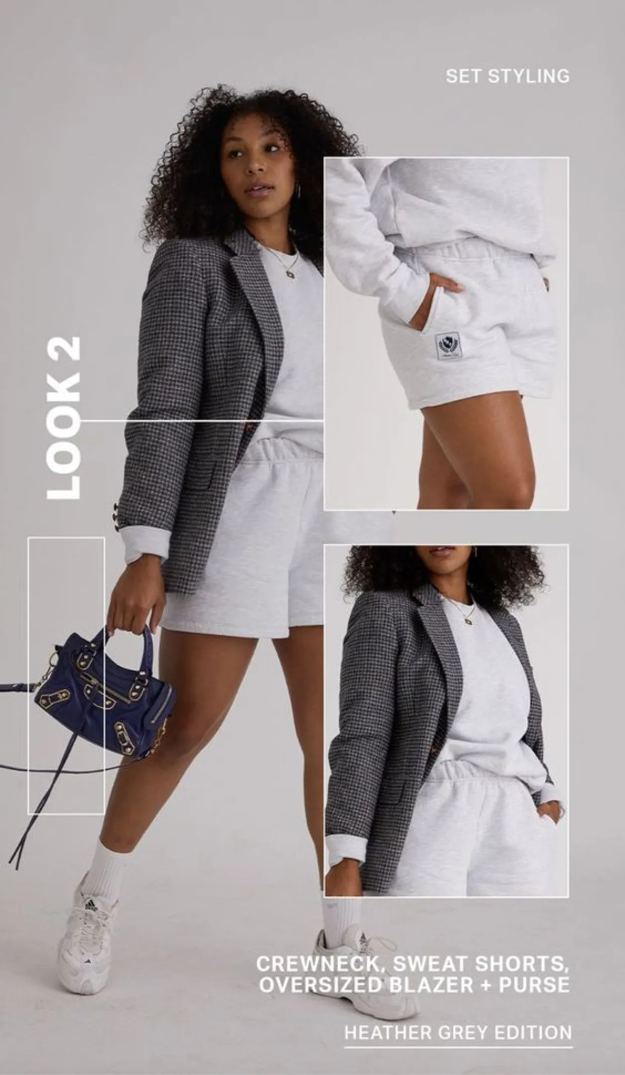

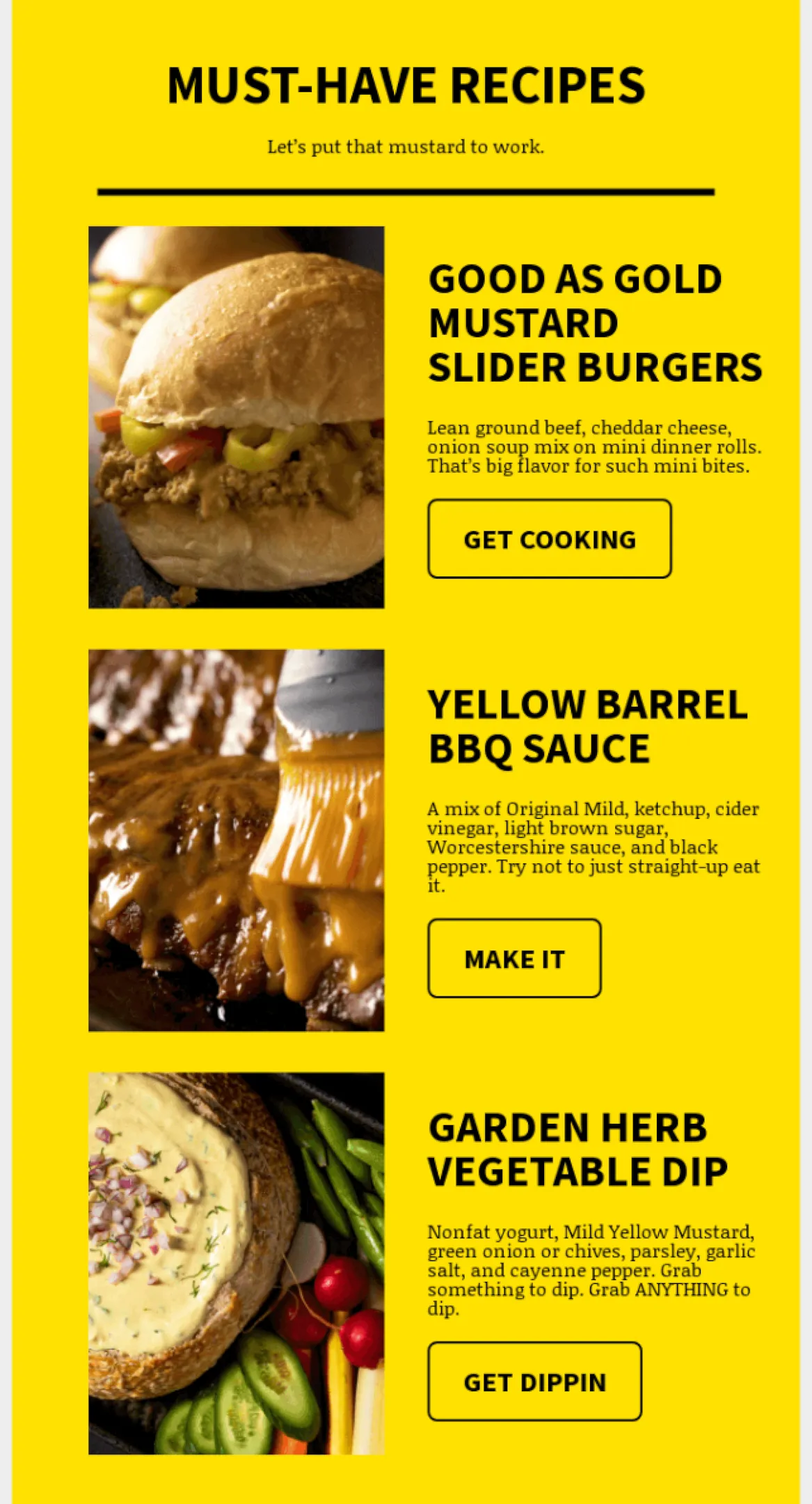
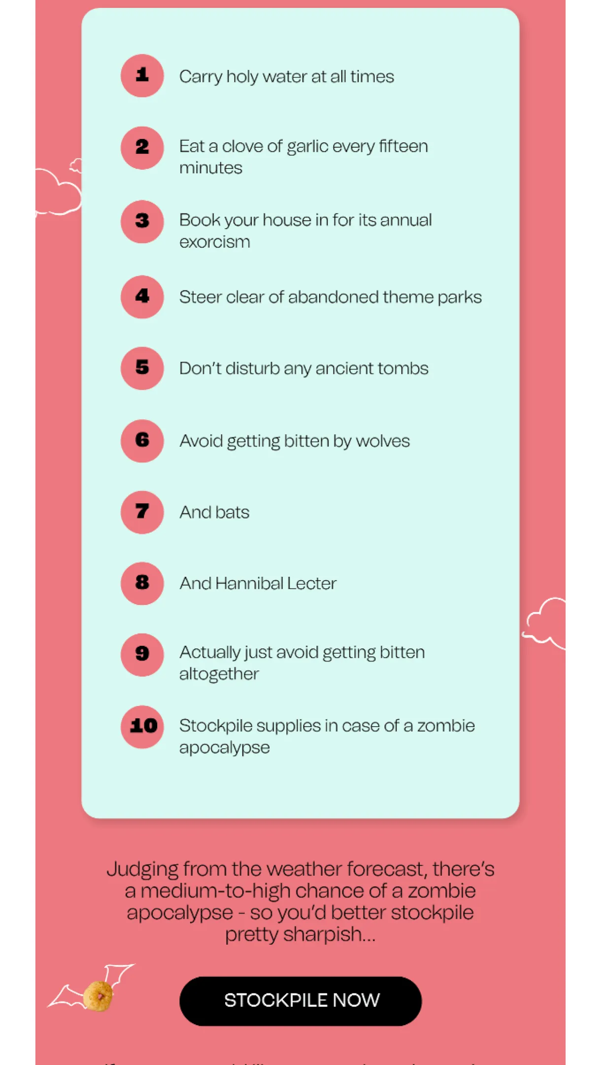

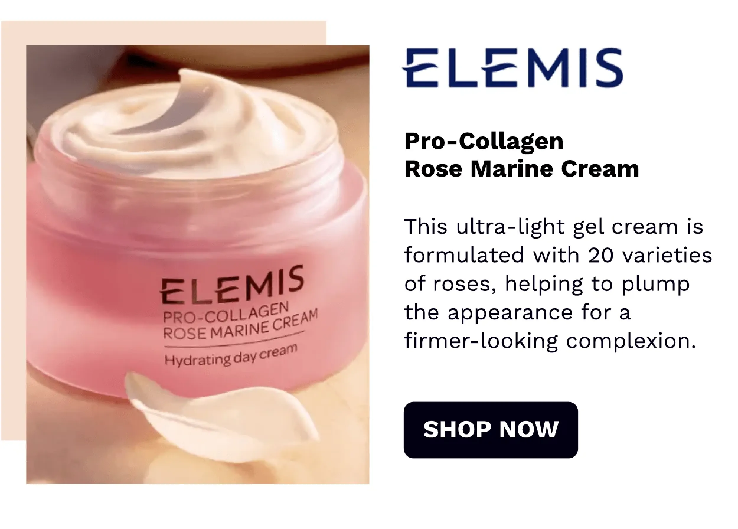
Additional Modules
In addition to the main body of the email, there are a variety of additional modules e-commerce brands include as add-ons to share additional information. These add-on modules are designed to increase engagement and drive conversions.
A few common ways additional modules are used include driving awareness for SMS & loyalty programs, recommending additional products or content, and reminding potential shoppers of an ongoing promotion.
SMS opt-in modules allow recipients to sign up for SMS updates and promotions, providing a new channel for marketers to reach their audience.
Loyalty program modules highlight the company’s loyalty program, encouraging customers to engage and earn rewards.
Product recommendations modules suggest additional products based on the recipient’s previous purchases or browsing history, helping to increase the average order value.
Content recommendations modules suggest related blog posts or other content that might be of interest to the recipient, increasing engagement and driving traffic to the website.
Ongoing promotion push modules provide a reminder of an ongoing promotion, encouraging recipients to take advantage of the offer before it expires.
By incorporating these additional modules into their email campaigns, DTC ecommerce owners and marketers can create a more comprehensive and engaging experience for their audience, driving conversions and building brand loyalty.
Additional Module Examples
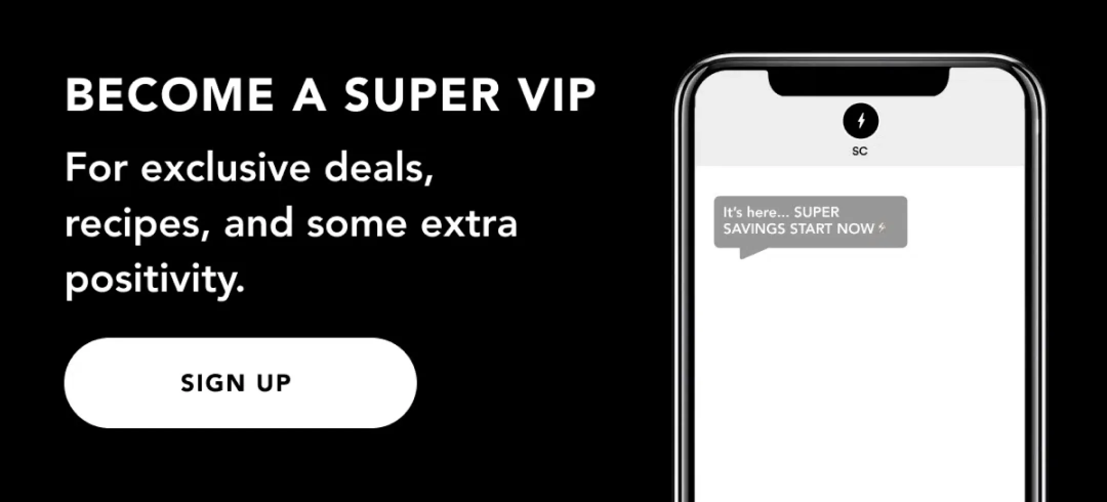

Footer
The footer is often an under-utilized portion of an effective email, because it is a space that can be used to help an e-commerce brand establish legitimacy & build trust.
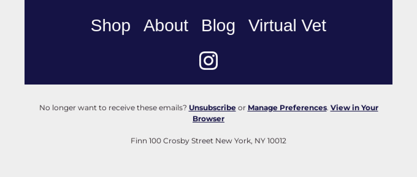
The footer is the bottom section of the email that typically contains important information such as the company’s physical address, contact information & unsubscribe link. It can also include social media icons, links to key web pages.
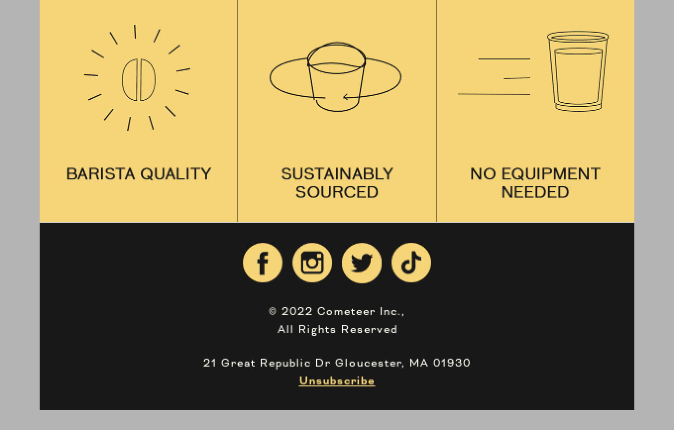
One way many e-commerce brands leverage the footer of their email to create an enjoyable user experience is by including links & information to their customer service or support pages. Many brands also use the footer to highlight key value propositions such as free shipping, satisfaction guarantee, or other features of their brand.
Here are several key elements to include in your footer:
• Unsubscribe link
• Contact information
• Social media icons
• Links to high-converting/popular pages
• Links to customer support
• Key value propositions to convert customers such as free shipping, satisfaction guarantees & specific brand/product features (eg. Non-GMO, Sustainable etc.)
Footer Examples

Headlines
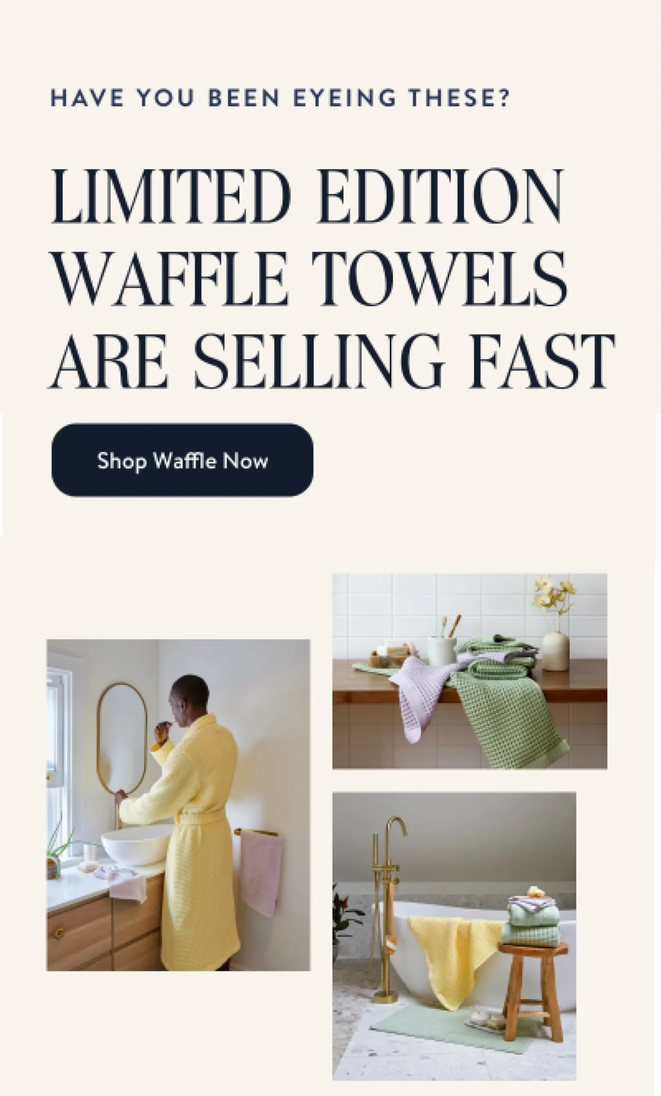
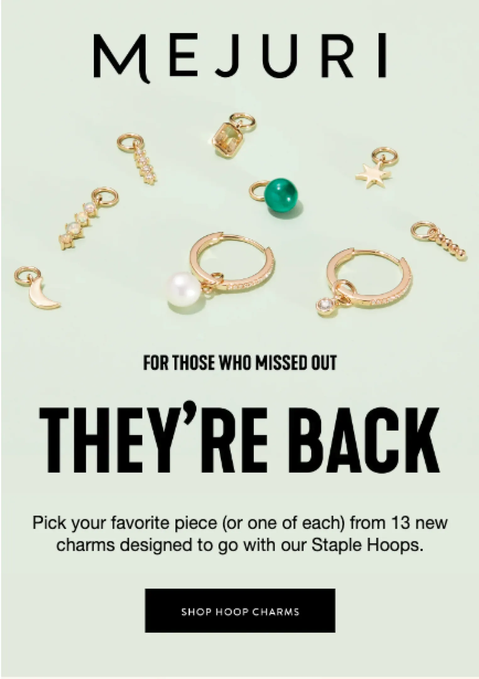
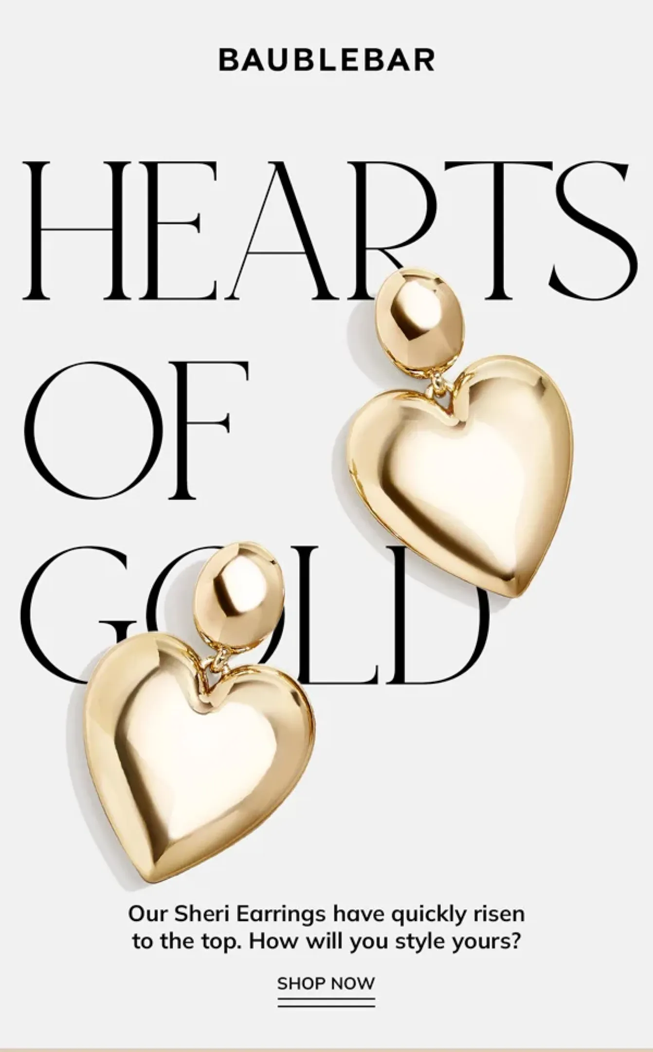
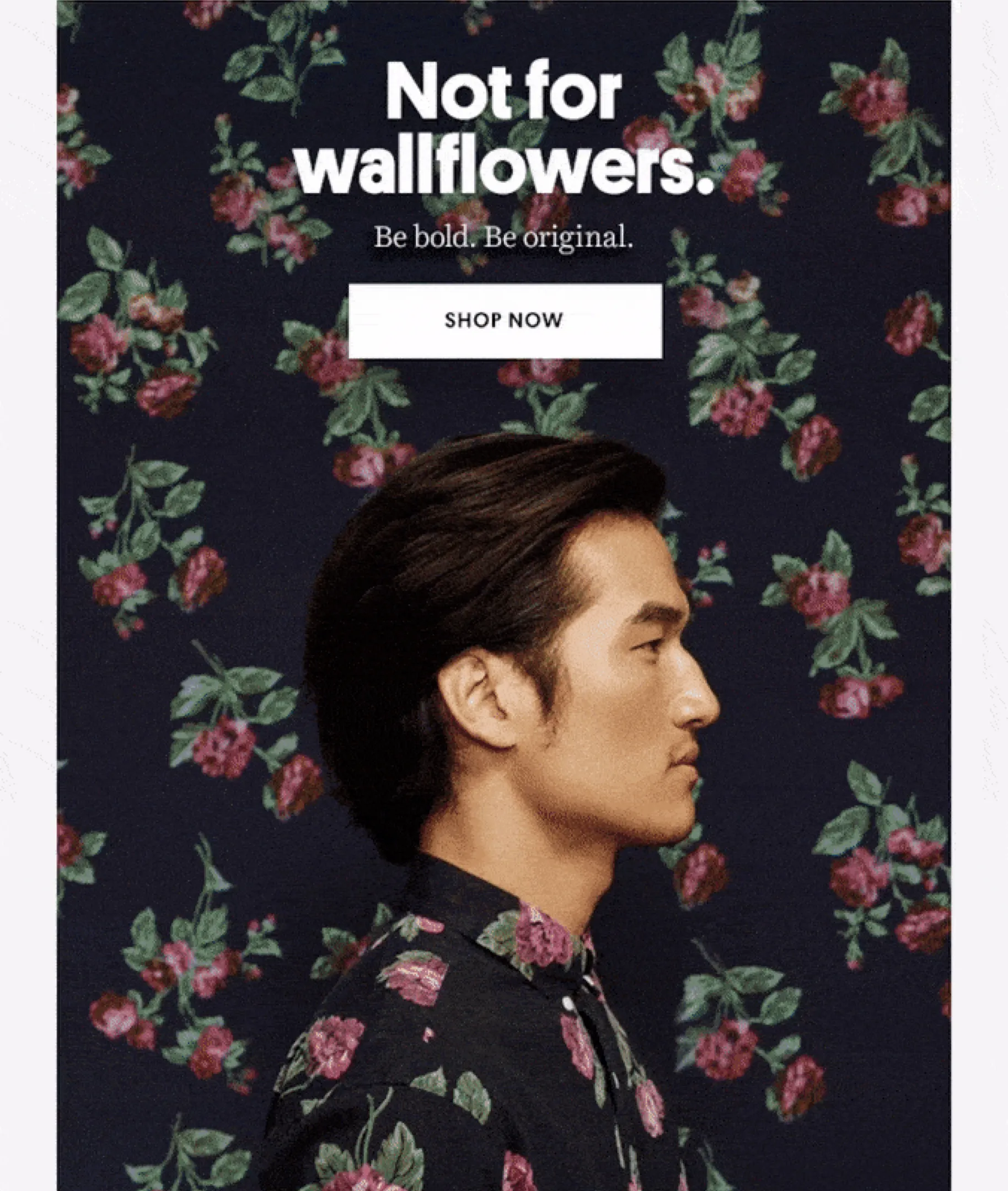
Headlines are the key message or title that is displayed prominently in each module or section of the email.
The most important headline is the one in the your email header since this is what the recipient will see first when the open the email. The headline of your email header determines whether the reader clicks to your website, continues reading the email, or closes it. It also sets the tone for the rest of the email content.
It should also be aligned with the email’s subject line and preview text to create a consistent message throughout the email.
Depending on your email layout, you may also have additional sub-headlines in each of the sections of your email. These headlines should be short, easy to read & tell the reader what to expect in that section of the email to get them to continue reading.
For copywriters, it’s important to keep headlines simple, direct, and attention-grabbing. It needs to act as a hook, to continue grabbing the readers’ interest throughout the email, while also being informative and relevant.
For designers, effective email design means keeping headlines eye-catching & often in a larger font. Many e-commerce brands use colors and typography to make the headlines stand out.
Headline Examples
Call-To-Action (CTA)
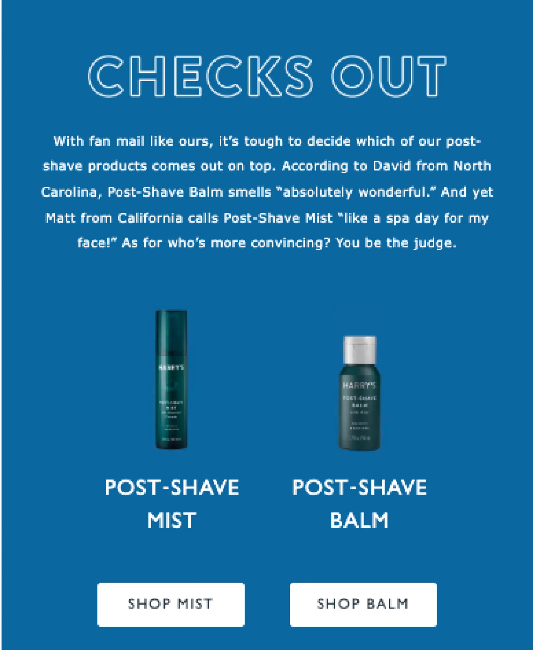
A call to action (CTA) is a button or link within an email that encourages the recipient to take a specific action, such as making a purchase, reading a blog post, or visiting your website. CTAs are a crucial component of an effective email marketing campaign as they drive conversions and help achieve the desired outcomes for the email.
It’s important to have at least one CTA in the header of your email, as well as multiple CTAs throughout your email.
For copywriters, it’s important to use strong, action-oriented language in the CTA to encourage recipients to click through. Testing different versions of the CTA language can help determine the most effective phrasing for your email subscribers.
Designers should also keep in mind that when it comes to effective email design, CTAs need to stand out visually from the rest of the email. This is often done by using bolder, contrasting colors, larger font sizes & different typography to make the CTA more prominent and increase its click-through rate.
It’s also important to make sure the CTA buttons are easily seen & clickable for both desktop and mobile users.
Call-To-Action (CTA) Examples

A white-glove service built for success.
We've planned every part of your client experience so you know you're in good hands.
Related Posts

Post-Purchase Nurture Flow
The Post-Purchase Nurture Flow maintains engagement by thanking customers, educating customers on how to use the product & sharing content relevant to their challenges. It targets recent buyers, fostering a post-purchase relationship that enhances customer loyalty and lays the groundwork for repeat business.What’s A Post-Purchase Nurture Flow?A Post-Purchase Nurture Flow is the first few emails a customer gets after they make a purchase (besides transactional emails like an Order Confirmation). This is one of the most commonly underused but important emails for a DTC ecommerce brand because it builds brand loyalty with purchasers.The best way to keep customers is to make sure they have a great experience of your brand and products, so they return to make future purchases.That’s why building a great Post-Purchase Nurture flow is the first step to retaining more customers, getting more repeat purchases & increasing customer lifetime value (LTV). An effective Post-Purchase Nurture builds brand loyalty by thanking customers, educating them on how to get the most of your products.# Of Emails: 5Flow Length: 10-15 daysWhat’s the goal of a Post-Purchase Nurture Flow?To nurture customers to become repeat customers & raving fans which:Increases your repeat purchase rate by getting more customers to return to make additional purchasesGets...

The Guide to Email Marketing KPIs: How to Measure and Optimize Your Email Campaigns
Like most marketing channels, growing your email revenue is a process of continual growth and optimization. Once you're regularly sending out email campaigns, your email marketing KPIs will tell you where there is room to optimize, try new campaign ideas, and run A/B tests. E-commerce brands often leave thousands of dollars of revenue on the table because they don't regularly review their performance & optimize their email marketing strategy based on their insights. Sometimes, something as simple as a different send time or a change in the email layout can create 15-20% more lift in revenue. Sometimes, your email marketing KPIs will help you identify new types of email marketing campaigns that your subscribers engage with more.Another common mistake e-commerce brands make is sending out the same few email marketing campaigns each month, which eventually end up feeling repetitive to subscribers. Regularly measuring & optimizing your campaigns includes coming up with new ideas to test.To make the most out of your email marketing efforts, every e-commerce brand should follow this process:Send Email CampaignsUpdate A Weekly Reporting DashboardAnalyze the data at least once a month (ideally weekly!)Identify opportunities for A/B tests, segmentation, and other campaign ideasDeploy new tests & ideas on...

Mastering the Art of Email Marketing: Best Practices for Success
Email marketing is one of the essential marketing channels that every direct-to-consumer (DTC) e-commerce brands needs to master to grow their revenue, drive conversions, retain customers & build a sustainable, scalable business. With this guide, you'll be able to get from zero to launched & start driving revenue from email marketing. We'll break down the email marketing best practices, from planning your campaigns to analyzing the results.Don't have time to master email marketing yourself?Get started with Backbone to get a custom-built email marketing strategy & email layouts for your business, all based on email marketing best practices.Book Your DemoPlanning Your Email CampaignDefining Your ObjectivesRevenue is always the end goal for any DTC e-commerce brand, but how will this email campaign drive revenue? Before launching your email marketing campaigns, start by defining the objective of the campaign.Here are a few different ways that email campaigns drive revenue:By announcing something new & exciting (such as a promotion, product launch or collaboration)By creating urgency (such as a limited edition product selling out or a promotion ending)By educating customers (such as content emails & seasonal tips)By showing how your product can solve a customer's problems (such as showing how your product works)By showing the benefits of your product...

From Idea To Launch: How To Create A Successful Email Marketing Campaign – 2024 Guide
Email marketing is a powerful tool that can help ecommerce stores nurture, convert & convert potential customers. In fact, email marketing should be generating 20-30% of the total revenue for your ecommerce store.However, creating an effective campaign that converts customers & generates revenue requires more than just adding images & copy to an email template.In this guide, we will walk you through the step-by-step process of building & launching an email marketing campaign from idea to launch. This email workflow will help you build an email marketing strategy for your campaign, write engaging copy, design an email that converts, and send it to the right audience.You'll also learn actionable tips to help you create campaigns that drive engagement and revenue for your business. Whether you're new to email marketing or a seasoned pro, this guide will give you the tools and knowledge you need to create successful campaigns that drive results.Step 1 // Email Brief: Building Your StrategyThe first step in creating a successful email marketing campaign is to develop an email brief. This is typically done by the Email Marketing Manager or the Head of Marketing. An email brief is a document that outlines the key information for your...

Building An Email Marketing Team: The 6 Roles Of A Dream Team
Often ecommerce stores grow from 6-figure to 7-figure & 8-figure companies before they wish they had invested more into email earlier on. Often this means ecommerce stores are easily leaving hundreds of thousands of dollars on the table.Email marketing is a powerful tool for any business, and it's essential to have the right team in place to maximize its potential.But what does an effective email marketing team look like?From the strategic planner to the creative designer, each role plays a vital part in building a team that can strategize, create and execute effective email campaigns that drive engagement and revenue.By understanding these roles and how they work together, you'll be able to build a team that can take your email marketing efforts to the next level.Here we'll explore the 6 key roles that make up a dream email marketing team, and how each role contributes to the success of your email marketing efforts:1. The Email Marketing ManagerA successful Email Marketing Manager also known as an Email Strategist, is able to develop and implement a comprehensive email marketing strategy that aligns with the overall business goals, and consistently delivers results in terms of email engagement, conversions and revenue.They lead and manage...

The 6 Most Important Email Marketing Metrics You Should Be Measuring For Your Ecommerce Store
Email marketing is an essential aspect of any e-commerce business, and it's important to have the right metrics in place to measure the success of your email marketing efforts.One of the most important (and often overlooked) steps in executing a successful email marketing strategy is analyzing how your customers respond to your emails and applying what you learn along the way.But most companies only track open and click rates or the total revenue coming from their emails. The problem is, this doesn’t paint the full picture of how their email marketing is directly affecting their bottom line nor provide actionable insights to improve email performanceHere are the most 6 important email marketing metrics that e-commerce brands should be measuring to ensure that their campaigns are effective and driving revenue:1. Percentage of RevenueLet’s say you’re making $10,000 from email every month. That sounds pretty great right?Maybe.It is, if your ecommerce store is generating $30,000 in revenue per month. But it's a sign of underperformance if your ecommerce store is generating $150,000 in revenue per month.Most ecommerce stores make the mistake of only tracking total email marketing revenue.Instead, monitor how big a slice of your revenue pie is coming from email marketing and adjust...

How To Setup Klaviyo In 15 Minutes – 2024 Complete Guide
What is Klaviyo?Klaviyo is an all-in-one email marketing automation platform that allows e-commerce businesses to create and send highly targeted email campaigns, track customer behavior, and analyze the performance of your campaigns.With Klaviyo, you'll be able to generate more sales, increase customer engagement, and build sustainable growth. It seamlessly integrates with your e-commerce store, making it super easy to automate & personalize those important follow-up emails, like abandoned cart reminders and personalized product recommendations.Using a marketing automation platform like Klaviyo is absolutely critical for all ecommerce brands in 2024.Is Klaviyo the best email marketing automation platform for my ecommerce brand?If you're a DTC ecommerce store owner, you know that choosing the right email marketing platform is crucial for your business success.While there are several options available, such as MailChimp, Active Campaign and others, Klaviyo stands out as the best choice for e-commerce stores for a few reasons:Automation: Klaviyo's automation capabilities are specifically designed for e-commerce businesses, making it easier to set up and execute targeted campaigns, such as abandoned cart reminders or personalized product recommendations, which can increase conversions and boost sales.Segmentation: Klaviyo's segmentation features are more advanced compared to its competitors, allowing you to create highly targeted campaigns and send messages...

How To Use Klaviyo Like A Pro – 2024 Complete Guide
1. Create an emailBuilding an email in Klaviyo is extremely simple with their drag and drop builder. You can also follow the same steps below to create an email for a flow since their email builder is the same for both types of emails.To get started with creating an email in Klaviyo, click on "Email Templates" then click "Create Template". This will bring you to their email builder. This is a good way to get familiar with building an email in Klaviyo before learning to set up flows and send campaigns.Here are the key elements to create emails that engages subscribers and converts customers:Subject Line: The subject line is the main text an email subscriber sees in their inbox before they open the email. You want your subject lines to generate curiosity & interest for the reader to read the email.Preview Text: The preview text is the additional information after the subject line that gives the reader more context on what the email is about within their inbox.Navigation Bar: The navigation bar is typically in every email and directs the reader to key pages on your website.Banner: A banner in an email is typically a short section above the header of the email to...

Welcome Flow
The Welcome Flow is a series of emails to greet new email subscribers. It builds trust & generates revenue by sharing your brand story, introducing them to your products & encouraging them to make their first purchaseWhat’s A Welcome Flow?A Welcome Flow is the first point of contact between your brand and a new email subscriber subscriber. Once a website visitor opts-in to your email list through your website pop-up, the Welcome Flow introduces the lead to your brand & products.# Of Emails: 5Flow Length: 5-10 daysWhat’s the goal of a Welcome Flow?To get non-purchasers to make their first purchase by introducing them to the brand & guiding them towards the product(s) they should purchase which:Converts more new email subscribers into paying customers (which means more revenue!)Gets potential customers to make their first purchase faster (ie. the amount of time it takes someone to go from being aware of the brand to becoming a customer)Gets more revenue out of each lead you drive to your website (which means lower CPAs & more value from your website traffic)Generates a higher average order value (AOV) for first-time customers by introducing them to more products that they may be interested inWelcome Flow EmailsEmail #1: WelcomeAn email to welcome...

The 1-2 Punch: How to Combine Direct Mail & Email Marketing to Nurture, Convert & Retain Customers
Instagram and avocado toast. Mario and Luigi. Email and direct mail. Think one of these pairs doesn’t belong? Wrong. They’re all things that work beautifully together. Email and direct mail aren’t competitors; they’re complimentary channels in a smart ecommerce marketing portfolio. Together they can help nurture leads, convert customers and increase customer lifetime value. How Direct Mail and Email Marketing Stack UpBefore you start layering direct mail and email marketing together, it’s important to understand the strengths of each channel. Email and direct mail have some significant similarities. Both are trackable and can be automated. Both enable one-to-one personalization—you can customize everything from greetings to visuals to discount codes. The big differences between email and direct mail are in reach, response, speed and cost. One isn’t better than the other—they have advantages that complement one another, which it’s why it’s smart to use them in concert. Reach: Email is easy to send and has a broad reach. Open rates generally max out around 30%. Direct mail has an estimated 90% open rate, because there’s less competition in physical mailboxes. Response: According to Campaign Monitor, the average email click-through rate is 2.3%, which means volume is important. The Data & Marketing Association shows an average 9% response rate for direct mail campaigns,...


